Remeeco – Logo Design
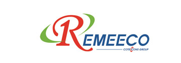
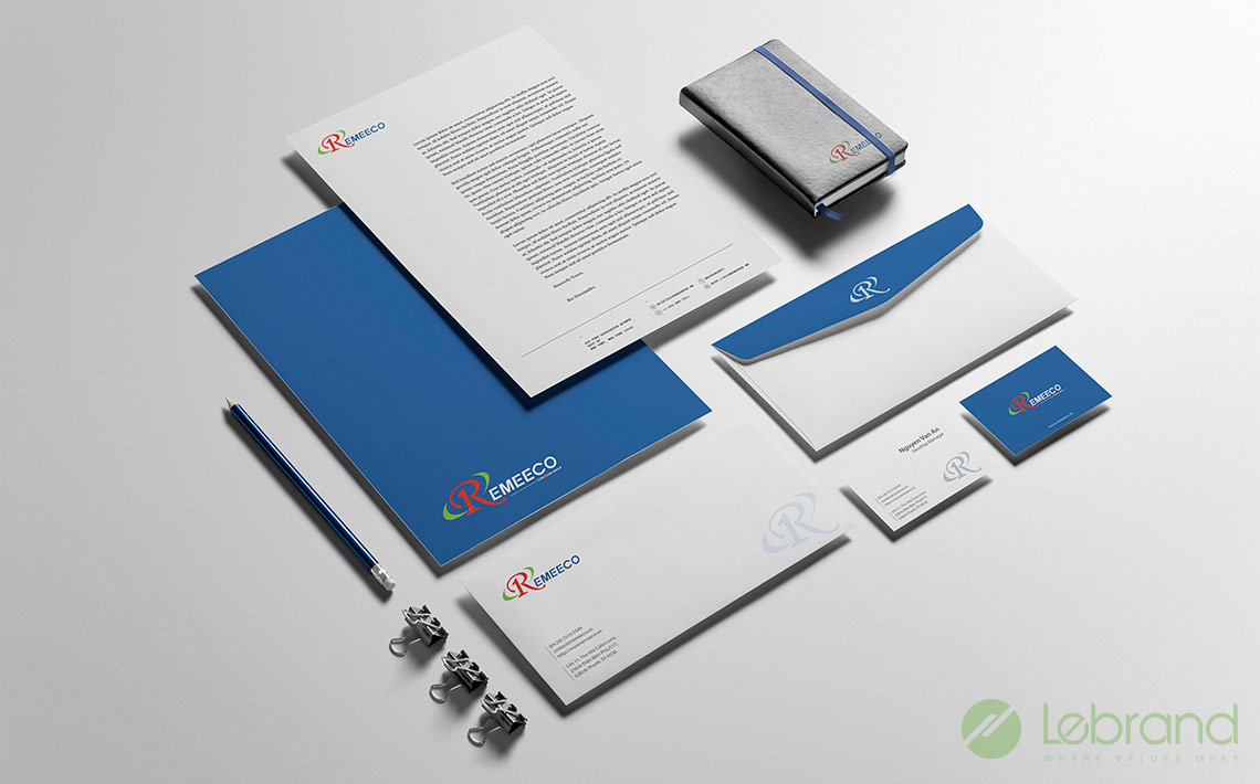
Lebrand took on this brand development project with the following requirements: The Remeeco logo must ensure the common identity of the identity system structure of the Coteccons group, at the same time, have its own unique features.
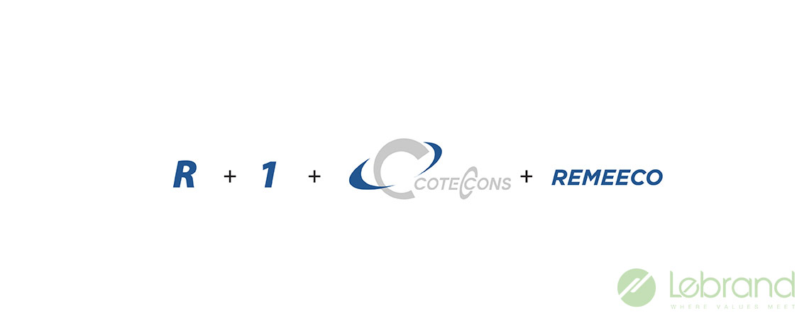
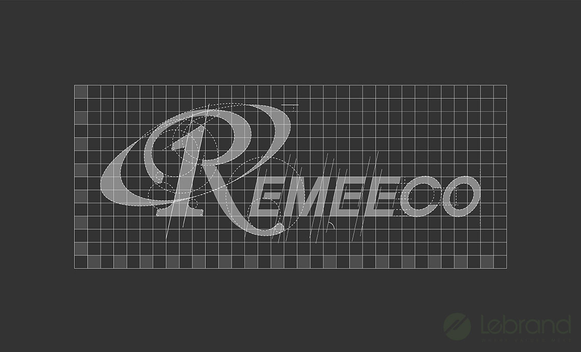
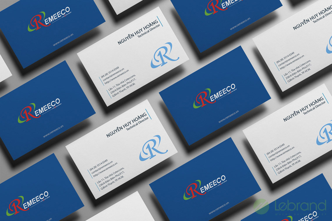
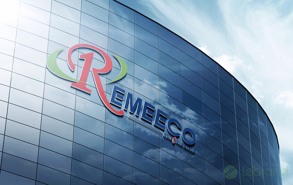
The Remeeco logo is designed with a soft stylized letter R, forming the unique symbol with a tilt in harmony with the curve of the globe which is the special identity of the Coteccons Group Logo. Image 1 represents Remeeco’s development vision to become a leading company in the field of mechanical and electrical construction not only in Vietnam but also on over the world.
The logo design achieves two criteria: inheriting the identity and reputation of Coteccons Group, and harmonizing and unifying the group’s brand structure, easily recalling it in the minds of customers and partners as well as affirming its leading role of a company specializing in mechanical and electrical construction.
