Hoa Thien Phu – Branding

Lebrand designs and builds the brand image of Hoa Thien Phu, a professional pharmaceutical company providing Oriental medicine and functional foods for human healthcare. Based on the idea of a pharmaceutical industry, nature is the place where mysteries have been kept for thousands of years with Asian characteristic plants and folk medicines.
The concept of Flower is the main idea throughout Hoa Thien Phu logo design aiming at expressing the brand's message:
- The flower symbolizes medicine, purity and beauty.
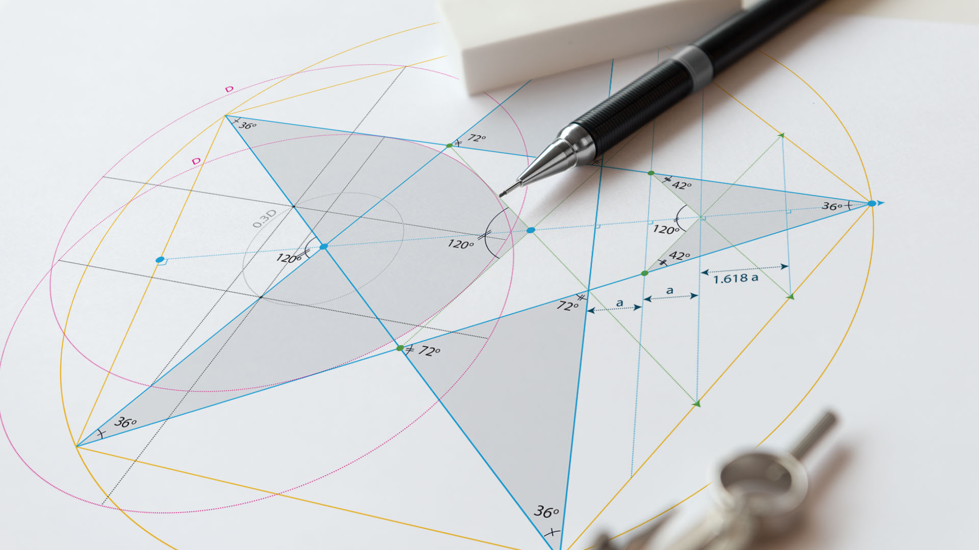
- According to feng shui, number 6 means "lucky" and also symbolizes 6-petal stylized flower with the image of a pill rotating in an upward direction, constantly moving in a rotating circle.


